


The Crucial Role of Responsive Web Design in the Mobile-Centric Era
In a mobile-centric world, the importance of responsive web design cannot be overstated. With an ever-increasing number of users accessing websites from mobile devices, it has become imperative for businesses and web developers to prioritise mobile optimisation. In this blog, we’ll explore the significance of responsive design and how it impacts user experience (UX) and search engine optimisation (SEO). We’ll also discuss the role of web development services in achieving SEO-friendly websites.
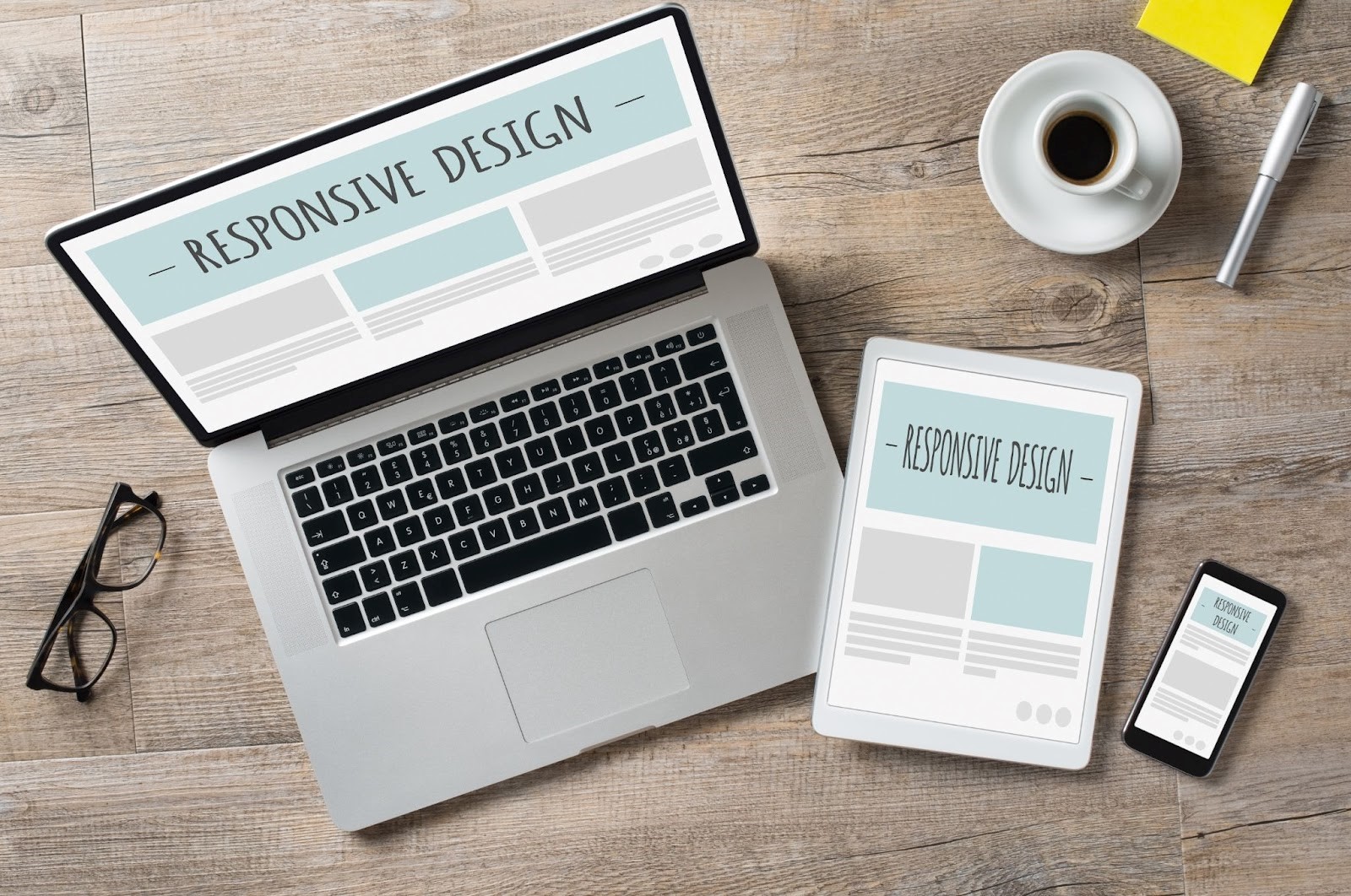
What is Responsive Web Design?
Responsive web design is an approach to designing and developing websites that ensure they adapt to different screen sizes and devices. This means your website should look and function well, whether viewed on a desktop computer, tablet, or smartphone. The primary goal is to provide an optimal user experience, regardless of the device used to access the site.
The Mobile-Centric Web Design Era
We’re living in a mobile-centric world. The proliferation of smartphones and tablets has fundamentally changed how people consume online content. According to Statista, as of 2021, mobile devices accounted for over 50% of all global website traffic. This statistic underscores the need for websites to be mobile-friendly.
Impact on User Experience (UX)

A responsive web design is a cornerstone of a positive user experience. When your site is optimised for mobile devices, users can easily navigate and interact with it. Buttons are appropriately sized, text is readable, and images load quickly. A good UX keeps visitors engaged, reduces bounce rates, and increases the likelihood of conversions.
In contrast, a non-responsive website can be frustrating for mobile users. Constant zooming in and out, awkward scrolling, and unclickable links can push users away. These poor experiences lead to lost opportunities for businesses.
SEO-Friendly Websites
Search engines like Google recognise the importance of mobile-friendly websites. In fact, Google uses mobile-first indexing, which means it primarily uses the mobile version of a site for ranking and indexing. Therefore, your site may suffer in search engine rankings if it is not mobile-friendly.
Responsive web design can boost your SEO efforts by:
- Improved Mobile User Experience: As mentioned earlier, responsive design enhances the mobile user experience, which is a factor considered by search engines.
- Reduced Bounce Rates: A user-friendly mobile experience leads to lower bounce rates, which is another metric search engines look at when ranking websites.
- Faster Loading Times: Responsive sites are often faster on mobile devices, positively influencing SEO since page speed is a ranking factor.
- One URL, One Content: With responsive design, you have a single URL for desktop and mobile versions, avoiding duplicate content issues that can harm SEO.
Web Development Services for Responsive Design

Creating a responsive website involves technical expertise. Many businesses rely on web development services to ensure their websites are responsive and well-optimised for mobile users. Professional web developers have the skills to design and code websites that adapt seamlessly to various screen sizes and resolutions.
These services can help in:
- Designing Mobile-Friendly Layouts. Web designers can craft layouts that look great on small screens, ensuring a seamless user experience.
- Responsive Coding. Developers use coding techniques such as CSS media queries to make sure your site adjusts correctly to different devices.
- Testing and Debugging. Thorough testing on various devices is crucial to identify and fix any issues that may arise.
- Optimising Load Times. Developers can implement techniques to improve page loading speed on mobile devices.
In conclusion, responsive web design is no longer an option but necessary in today’s mobile-centric world. It significantly impacts user experience and SEO, both critical for the success of your online presence. Investing in responsive design and web development services is a wise choice if you want your website to reach and engage your audience effectively. Doing so will ensure that your website is user-friendly and search engine-friendly, ultimately improving online visibility and success.
Contact Us
Easy Websites™ is your dedicated partner in creating a beautifully designed, professional, and user-friendly website for your business. Whether you’re a small business owner, a skilled tradesperson (Tradie), or a startup, our team is here to provide tailored, cutting-edge digital marketing solutions to meet your unique needs.
Our comprehensive services include media creation, public relations, brand consulting, content marketing, social media management, SEO optimisation, web design, and website administration. To get in touch with us, you can call us at 1300 945 302 or email us at hello@easywebsites.io. If you have any questions or want to schedule a complimentary consultation, please complete our contact form on our website. Your journey to a more efficient and effective marketing strategy begins with Easy Websites™.
With our “Done-for-you” website services, you can have a stunning website, making the entire process hassle-free and efficient.
Don’t hesitate to contact us for all your web design and digital marketing needs.
Ready to take your small business to the next level?
Author